

Flutter でドロップダウン(プルダウン)メニューを表示するには、DropdownButton を使用します。今回は、この DropdownButton について紹介します!
DropdownButton の使い方
必要なプロパティ
DropdownButton のプロパティで必要なものは、以下3つです。value プロパティは必須ではないですが、選択中の値を表示するためには必要です。
- items:ドロップダウンで選択できる値
- value:選択中の値
- onChanged:値が選択されたときの処理
使用例
以下の例では、DropdownButton の各プロパティを設定し、独自クラス化しています。状態を持たせているのは、ユーザが値を選択したとき、選択中の値の表示(value プロパティ)を変更するためです。
import 'package:flutter/material.dart';

class DropdownButtonMenu extends StatefulWidget {
  const DropdownButtonMenu({Key? key}) : super(key: key);

  @override
  State<DropdownButtonMenu> createState() => _DropdownButtonMenuState();
}

class _DropdownButtonMenuState extends State<DropdownButtonMenu> {
  String isSelectedValue = 'あ';

  @override
  Widget build(BuildContext context) {
    return DropdownButton(
      items: const[
        DropdownMenuItem(
          value: 'あ',
          child: Text('あ'),
        ),
        DropdownMenuItem(
            value: 'い',
            child: Text('い'),
        ),
        DropdownMenuItem(
            value: 'う',
            child: Text('う'),
        ),
        DropdownMenuItem(
            value: 'え',
            child: Text('え'),
        ),
        DropdownMenuItem(
            value: 'お',
            child: Text('お'),
        ),
      ],
      value: isSelectedValue,
      onChanged: (String? value) {
        setState(() {
          isSelectedValue = value!;
        });
      },
    );
  }
}
上記のように独自クラス化したものを、表示させたい場所に記述して使用します。(以下ソースコードでは7行目)
@override
Widget build(BuildContext context) {
return MaterialApp(
home: Scaffold(
appBar: AppBar(title: const Text('DropdownButton Sample')),
body: const Center(
child: DropdownButtonMenu(),
),
),
);
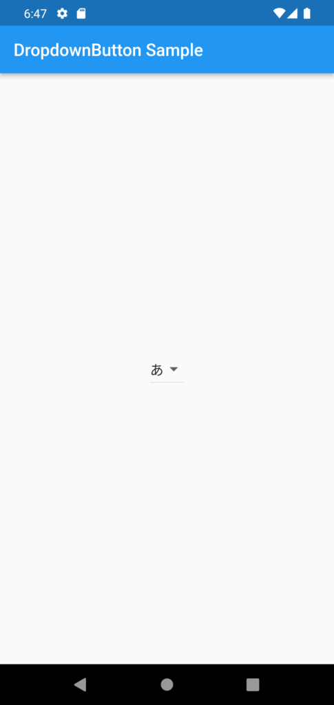
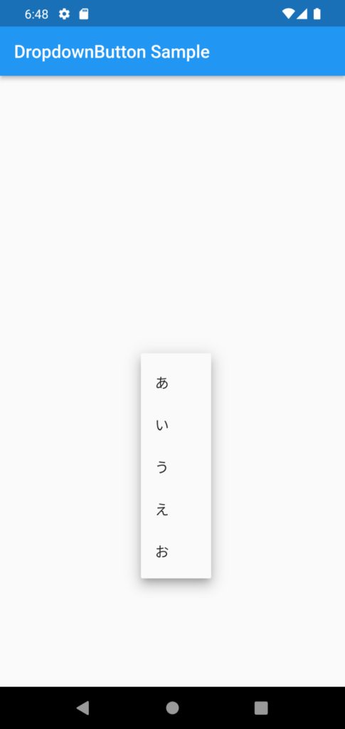
}画面で表示すると、以下のようになります。
上記のソースコードは、リストを用意することで items の部分を以下のように簡潔に書くこともできます。
import 'package:flutter/material.dart';

const  List<String> choices = <String>['あ', 'い', 'う', 'え', 'お'];

class DropdownButtonMenu extends StatefulWidget {
  const DropdownButtonMenu({Key? key}) : super(key: key);

  @override
  State<DropdownButtonMenu> createState() => _DropdownButtonMenuState();
}

class _DropdownButtonMenuState extends State<DropdownButtonMenu> {
  String isSelectedValue = choices.first;

  @override
  Widget build(BuildContext context) {
    return DropdownButton(
      items: choices.map<DropdownMenuItem<String>>((String value) {
        return DropdownMenuItem<String>(
          value: value,
          child: Text(value),
        );
      }).toList(),
      value: isSelectedValue,
      onChanged: (String? value) {
        setState(() {
          isSelectedValue = value!;
        });
      },
    );
  }
}
DropdownButton のデザイン変更
DropdownButton には、上で紹介したプロパティ以外にも様々なプロパティがあります。以下に紹介するプロパティを設定することで、DropdownButton のデザイン変更ができます。
- dropdownColor:ドロップダウンの背景色
- elevation:リストを開いた時の影の濃さ
- icon:ドロップダウンボタンのアイコン
- iconSize:ドロップダウンボタンのアイコンの大きさ
- itemHeight:リストの高さ
- style:テキストスタイル
- underline:ドロップダウンボタンの下線
まとめ
Flutter で、ドロップダウンメニューを表示する DropdownButton について紹介しました!
以上で、【Flutter】ドロップダウン(プルダウン)メニューの作り方 は終わりです。