

Android で、ボタンのデザインをカスタムする方法について紹介します!
ボタンのデザインをカスタムする方法
カスタムデザイン用 xml ファイルを作成
まずは、カスタムデザインを記述する xml ファイルを作成します。
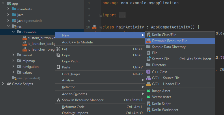
app/res/drawable を右クリックし、「New」>「Drawable Resource File」をクリックします。
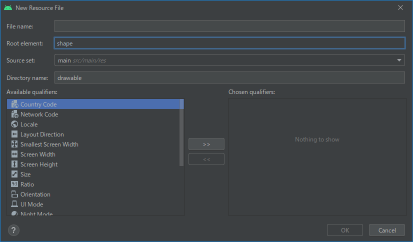
「File name」を適当に入力し、「Root element」に「shape」と入力します。
その他の項目は、そのままで良いです。
デザインを記述
前述の手順で作成したリソースファイルに、デザインを記述していきます。
<?xml version="1.0" encoding="utf-8"?>
<shape
    xmlns:android="http://schemas.android.com/apk/res/android"
    android:shape="rectangle">
    <corners
        android:radius="10dp" />
    <gradient
        android:angle="0"
        android:startColor="@color/teal_200"
        android:endColor="@color/purple_700"/>
    <stroke
        android:color="@color/black"
        android:width="5dp"/>
</shape>
指定できるレイアウトのうち、代表的なものを以下の表に記載しています。
| 要素 | 説明 |
| shape | 形を指定。 ルート要素にする必要がある。 |
| corners | 角の丸みを指定。 shape が rectangle(長方形)の場合のみ適用される。 |
| gradient | グラデーションを指定。 |
| solid | 塗りつぶす色を指定。 |
| stroke | 枠線を指定。 |
この他の要素や指定できる属性とその値等、より詳しく知りたい方は、以下のリンクをご参照ください。
https://developer.android.com/guide/topics/resources/drawable-resource#Shape
ボタンにデザインを登録
作成したデザインをボタンに登録します。
Button の android:background に、"@drawable/Resource名" のように指定します。
今回は、custom_button.xml でリソースファイルを作成したので、
android:background="@drawable/custom_button" と指定しています。
<?xml version="1.0" encoding="utf-8"?>
<androidx.constraintlayout.widget.ConstraintLayout xmlns:android="http://schemas.android.com/apk/res/android"
    xmlns:app="http://schemas.android.com/apk/res-auto"
    xmlns:tools="http://schemas.android.com/tools"
    android:layout_width="match_parent"
    android:layout_height="match_parent"
    tools:context=".CustomDesignActivity">

    <Button
        android:id="@+id/button"
        android:layout_width="wrap_content"
        android:layout_height="wrap_content"
        android:background="@drawable/custom_button"
        android:text="Custom Button"
        app:backgroundTint="@null"
        app:layout_constraintBottom_toBottomOf="parent"
        app:layout_constraintEnd_toEndOf="parent"
        app:layout_constraintStart_toStartOf="parent"
        app:layout_constraintTop_toTopOf="parent" />
</androidx.constraintlayout.widget.ConstraintLayout>
もし、Button の色が変わらなければ、上記ソースコードの15行目のように、
app:backgroundTint="@null" を指定しておきましょう。
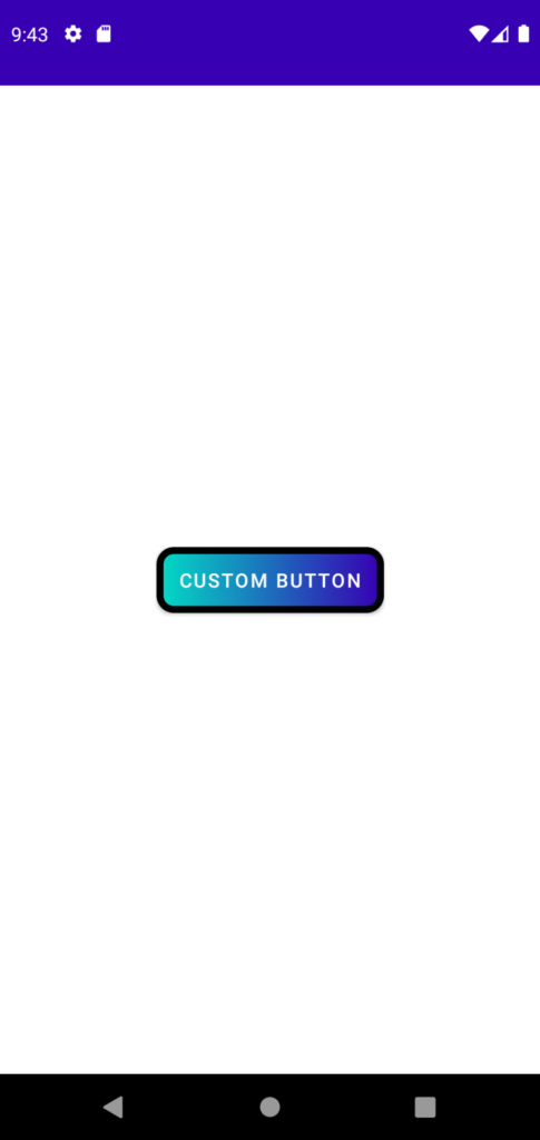
以下、上記ソースコードの実行例です。
まとめ
ボタンのデザインをカスタムする方法を紹介しました!
以上で、【Android】ボタンのデザインをカスタムする方法 は終わりです。
参考
おすすめ書籍

