
Flutter では、Checkbox ウィジェットを使えば、チェックボックスを表示できます。しかし、チェックボックスの横に文字などを表示して、文字部分をタップした時にもチェックボックスのチェック状態を切り替えたい場合、Checkbox ウィジェットでは大変です。そのような場合、ラベル付で文字も表示できる CheckboxListTile ウィジェットを使った方が良いです。そこで今回は、CheckboxListTile ウィジェットについて紹介します!
Checkbox ウィジェットについては、以下の記事で紹介しています。
基本の使い方
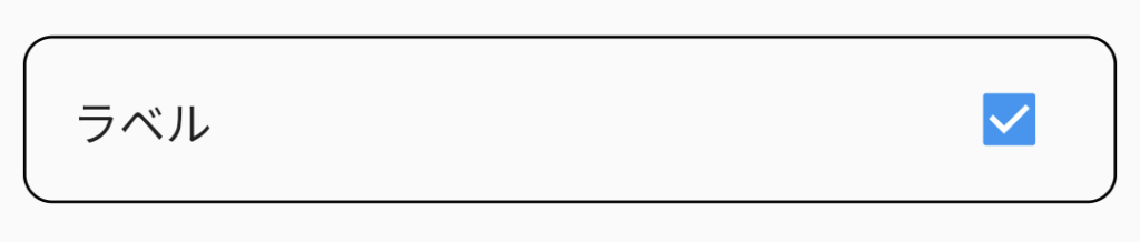
CheckboxListTile ウィジェットは、以下20〜28行目のように使用します。
Checkbox ウィジェットと同じ、value と onChanged プロパティに加えて、CheckboxListTile ウィジェットでは、title プロパティでラベルを表示できるようになっています。
import 'package:flutter/material.dart';
class CheckboxListTileSamplePage extends StatefulWidget {
const CheckboxListTileSamplePage({Key? key}) : super(key: key);
@override
State<CheckboxListTileSamplePage> createState() => _CheckboxListTileSamplePage();
}
class _CheckboxListTileSamplePage extends State<CheckboxListTileSamplePage> {
bool _isChecked = false;
@override
Widget build(BuildContext context) {
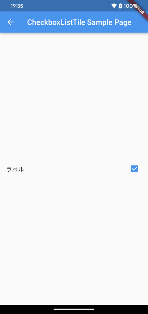
return Scaffold(
appBar: AppBar(
title: const Text("CheckboxListTile Sample Page"),
),
body: Center(
child: CheckboxListTile(
title: const Text('ラベル'),
value: _isChecked,
onChanged: (bool? value) {
setState(() {
_isChecked = value!;
});
},
),
),
);
}
}
デザイン変更方法
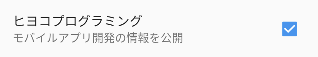
サブタイトルの追加
subTitle プロパティで、サブタイトルを追加することができます。
CheckboxListTile(
  title: const Text('ヒヨコプログラミング'),
  subtitle: const Text('モバイルアプリ開発の情報を公開'),
  value: …,
  onChanged: …,
),
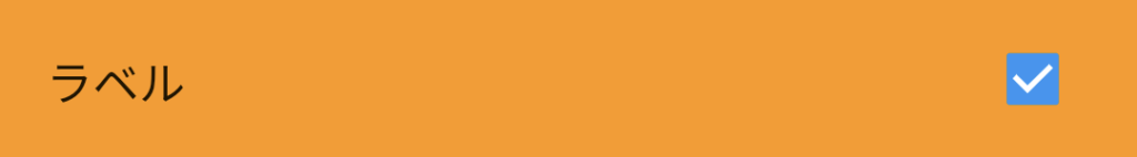
背景色
tileColor プロパティで、背景色を設定することができます。
CheckboxListTile(
  title: …,
  value: …,
  onChanged: …,
  tileColor: Colors.orange,
),
ボーダー、角丸
shape プロパティで、CheckboxListTile にボーダーの設定や、形を角丸に設定することができます。
以下の例では、RoundedRectangleBorder の side プロパティでボーダーの設定、RoundedRectangleBorder の borderRadius プロパティで角丸の設定を行なっています。
CheckboxListTile(
  title: …,
  value: …,
  onChanged: …,
  shape: RoundedRectangleBorder(
      side: const BorderSide(),
      borderRadius: BorderRadius.circular(10)
  ),
),
チェックボックスの位置
controlAffinity プロパティで、チェックボックスの位置を変更することができます。以下の例では、チェックボックスの位置を左側に変更しています。
CheckboxListTile(
  title: …,
  value: …,
  onChanged: …,
  controlAffinity: ListTileControlAffinity.leading,
),
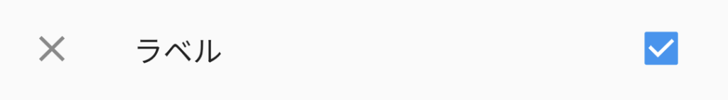
チェックボックスの反対側にウィジェット追加
secondary プロパティで、チェックボックスの反対側の位置にウィジェットを配置することができます。以下の例では、アイコンを配置しています。
CheckboxListTile(
  title: …,
  value: …,
  onChanged: …,
  secondary: const Icon(Icons.close),
),
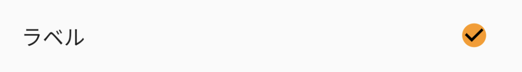
チェックボックスのデザイン
CheckboxListTile も、Checkbox ウィジェットと同じようにチェックボックスのデザインを変更できます。
CheckboxListTile(
  title: …,
  value: …,
  onChanged: …,
  fillColor: MaterialStateProperty.resolveWith((states) => Colors.orange),
  checkColor: Colors.black,
  checkboxShape: RoundedRectangleBorder(borderRadius: BorderRadius.circular(10)),
);
まとめ
ラベル付のチェックボックスを表示可能な CheckboxListTile ウィジェットについて紹介しました!
以上で、【Flutter】ラベル付チェックボックス(CheckboxListTile)の使い方、デザイン変更方法 は終わりです。