Flutter で、文字入力を受け付けるためのフィールドを作成する TextField の ウィジェットの使い方を紹介していきます。
基本の使い方
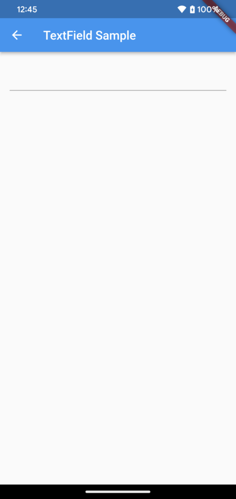
以下のように、TextField を設置することで、テキスト入力フィールドを表示させることができます。
@override
Widget build(BuildContext context) {
  return Scaffold(
      appBar: AppBar(
        title: const Text('TextField Sample'),
      ),
      body: Padding(
        padding: const EdgeInsets.all(16.0),
        child: SizedBox(
          width: double.infinity,
          child: TextField(),
        ),
      ),
  );
}
TextField の設定
ここでは、TextField の様々な設定を紹介していきます。
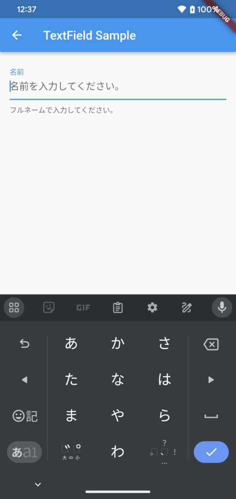
ラベル、ヒント、ヘルプの表示
以下のようにすることで、TextField に、ラベルやヒント、ヘルプを表示することができます。
ヒント(hintText)は、ユーザーが入力すべき内容を表示します。ヘルプ(helperText)は、入力する際の補足情報を示します。
TextField(
  decoration: InputDecoration(
    labelText: '名前',
    hintText: '名前を入力してください。',
    helperText: 'フルネームで入力してください。',
  ),
),
テキストスタイルの設定
TextField に表示するテキストのスタイルは、以下のようにして設定することができます。
TextField(
  style: TextStyle(
    color: Colors.blue,
    fontSize: 18.0,
    fontWeight: FontWeight.bold,
  ),
),
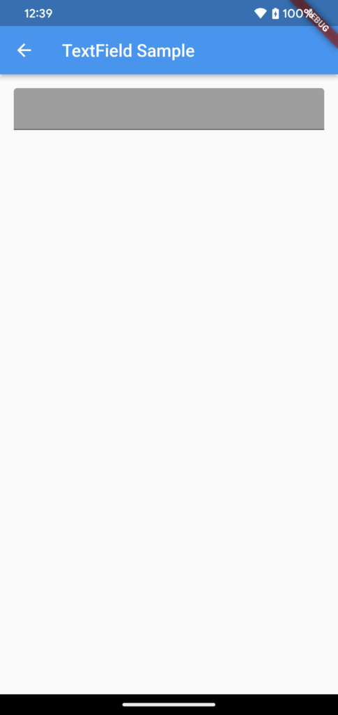
背景色の設定
以下のようにして、TextField の背景色を設定することもできます。
背景を塗りつぶすかどうかの設定である filled を true にして、fillColor で色を設定します。
TextField(
  decoration: InputDecoration(
    filled: true,
    fillColor: Colors.grey,
  ),
),
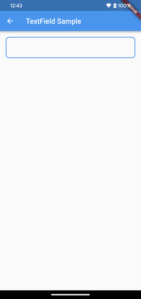
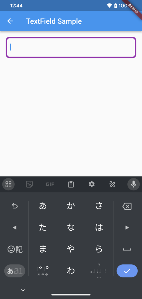
ボーダーの設定
以下のようにすると、TextField にボーダーの設定を行うことができます。
enabledBorder で、TextField にフォーカスが当たっていない時のボーダーを設定し、
focusedBorder で、フォーカスが当たった時のボーダーの設定を行なっています。
TextField(
  decoration: InputDecoration(
    enabledBorder: OutlineInputBorder(
      borderRadius: BorderRadius.circular(10.0),
      borderSide: BorderSide(
        color: Colors.blue,
        width: 2.0,
      ),
    ),
    focusedBorder: OutlineInputBorder(
      borderRadius: BorderRadius.circular(10.0),
      borderSide: BorderSide(
        color: Colors.purple,
        width: 4.0,
      ),
    ),
  ),
),
以下のスクリーンショット左側が enabledBorder、右側が focusedBorder の設定が反映されている様子を表しています。
入力値の取得
TextEditingController を使用することで、入力されたテキストを取得することができます。
まず、7行目で、TextEditingController のインスタンス生成をしています。
そして、29行目で、TextField に TextEditingController を設定して、32行目で入力値を取得しています。
class _TextFieldSamplePage extends State<TextFieldSamplePage> {
  late TextEditingController _controller;

  @override
  void initState() {
    super.initState();
    _controller = TextEditingController();
  }

  @override
  void dispose() {
    _controller.dispose();
    super.dispose();
  }

  @override
  Widget build(BuildContext context) {
    return Scaffold(
        appBar: AppBar(
          title: const Text('TextField Sample'),
        ),
        body: Padding(
          padding: const EdgeInsets.all(16.0),
          child: SizedBox(
            width: double.infinity,
            child: Column(
              children: [
                TextField(
                  controller: _controller,
                ),
                ElevatedButton(
                  onPressed: () => print(_controller.text),
                  child: const Text('OK'),
                ),
              ],
            ),
          ),
        ),
    );
  }
}
入力値の設定
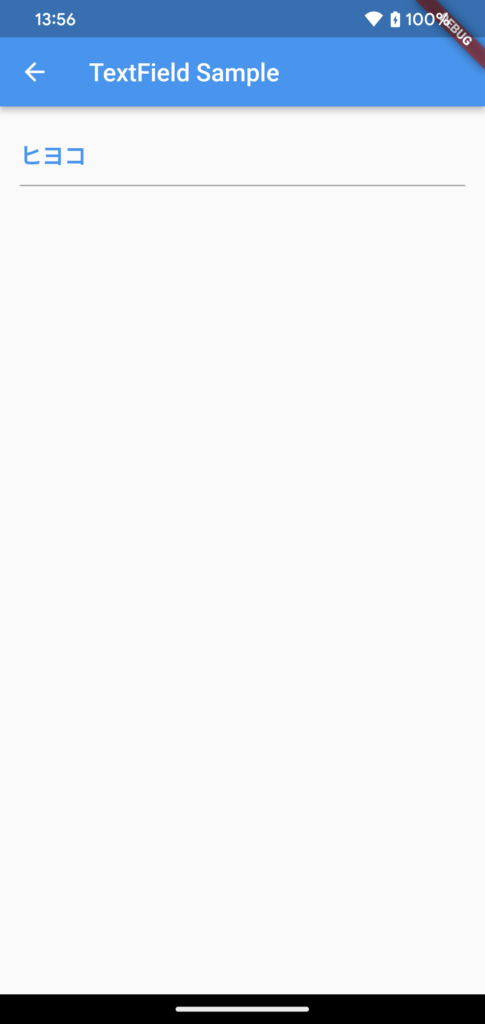
上記の TextEditingController を使用して、入力値を設定することもできます。
以下のように、TextEditingController の text プロパティに文字列を指定します。
「ボタンを押したら特定も文字列を入力する」ような動作を実現できます。
_controller.text = 'ヒヨコ';初期値の設定
TextEditingController のインスタンス生成時に、text プロパティを指定することで、初期値を設定することもできます。
_controller = TextEditingController(text: '初期値');まとめ
Flutter で、文字入力を受け付けるウィジェットである TextField について紹介しました!
以上で、【Flutter】TextField で文字入力を受け付ける は終わりです。