Flutter で使用できるボタンには、どのようなものがあるか基本的なものを紹介します。また、ボタンのデザインを変更する方法も一緒に紹介します。
基本的なボタンの種類
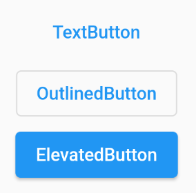
ボタン表示用 Widget には、基本的なものとして以下の3種類があります。
- TextButton
- OutlinedButton
- ElevatedButton
TextButton
テキストのみのボタンです。
TextButton(
  child: const Text('TextButton'),
  onPressed: () {},
),
OutlinedButton
テキスト+枠線のボタンです。
OutlinedButton(
child: const Text('OutlinedButton'),
onPressed: () {},
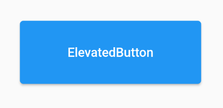
),ElevatedButton
背景と影が付いたボタンです。
ElevatedButton(
  child: const Text('ElevatedButton'),
  onPressed: () {},
),
表示例
各ボタンを表示した例が下図です。
デザインの変更方法
上で紹介した各ボタンは、色やサイズ等のデザインを変更できます。ここからは、各種デザインの変更方法を紹介します。
カラー変更
テーマカラー
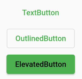
style パラメータに ***Button.styleFrom を指定し、primary に色を指定することで文字色や背景色の変更できます。
TextButton(
  child: const Text('TextButton'),
  onPressed: () {},
  style: TextButton.styleFrom(
    primary: Colors.green,   // 文字色変更
  ),
),

OutlinedButton(
  child: const Text('OutlinedButton'),
  onPressed: () {},
  style: OutlinedButton.styleFrom(
    primary: Colors.green,   // 文字色変更
  ),
),

ElevatedButton(
  child: const Text('ElevatedButton'),
  onPressed: () {},
  style: ElevatedButton.styleFrom(
    primary: Colors.green,     // 背景色変更
    onPrimary: Colors.black,   // 文字色とリップルエフェクトカラーの変更
  ),
),
上記ソースコードの実行例です。
タップ中のカラー
style パラメータに ButtonStyle を指定し、以下のソースコードのように記述することで、タップ中の色を変更することができます。
ElevatedButton(
  child: const Text('ElevatedButton'),
  onPressed: () {},
  style: ButtonStyle(
    backgroundColor: MaterialStateProperty.resolveWith<Color>(
      (Set<MaterialState> states) {
        if (states.contains(MaterialState.pressed)) {
          return Colors.green;  // タップ中の色
        }
        return Colors.blue;     // 通常の色
      },
    ),
  ),
),
リップルエフェクトのカラー
ElevatedButton では、文字色を指定しておき、styleFrom の onPrimary に色を指定することで、リップルエフェクトの色だけ変更することもできます。
ElevatedButton(
  child: const Text(
    'ElevatedButton',
    style: TextStyle(color: Colors.white),    // 文字色を固定
  ),
  onPressed: () {},
  style: ElevatedButton.styleFrom(
    primary: Colors.blue,
    onPrimary: Colors.black,    // リップルエフェクトカラーのみ変更(文字色は固定しているので変更されない)
  ),
),
サイズ変更
最小サイズを指定
***Button.styleFrom の minimumSize で最小サイズを指定することができます。
ElevatedButton(
  child: const Text('ElevatedButton'),
  onPressed: () {},
  style: ElevatedButton.styleFrom(
    minimumSize: const Size(200, 70),
  ),
),
上記ソースコードの実行例です。
SizedBox を使用してサイズを指定
ボタン Widget を SizedBox の子要素に指定することで、サイズを指定することができます。
SizedBox(
  width: 200,
  height: 70,
  child: ElevatedButton(
    child: const Text('ElevatedButton'),
    onPressed: () {},
  ),
),
上記ソースコードの実行例です。
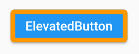
枠線のカスタマイズ
枠線の色・太さ
***Button.styleFrom の side に BorderSide を指定すると、color で枠線の色、width で枠線の太さを変更できます。
ElevatedButton(
  child: const Text('ElevatedButton'),
  onPressed: () {},
  style: ElevatedButton.styleFrom(
    side: const BorderSide(
      color: Colors.orange,
      width: 5,
    ),
  ),
),
上記ソースコードの実行例です。
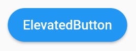
枠線の形
***Button.styleFrom の shape で枠線の形を変更することができます。
以下のソースコードのように、StadiumBorder を使用することで、ボタンの左右を円形にすることができます。
ElevatedButton(
  child: const Text('ElevatedButton'),
  onPressed: () {},
  style: ElevatedButton.styleFrom(
    shape: const StadiumBorder(),
  ),
),
上記ソースコードの実行例です。
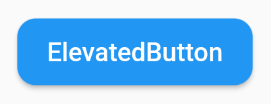
また、RoundedRectangleBorder を使用すると角丸のボタンを作成できます。
ElevatedButton(
  child: const Text('ElevatedButton'),
  onPressed: () {},
  style: ElevatedButton.styleFrom(
    shape: RoundedRectangleBorder(
      borderRadius: BorderRadius.circular(10),
    ),
  ),
),
上記ソースコードの実行例です。
まとめ
基本的なボタン表示用 Widget を3種類紹介しました!また、カラー変更やサイズ変更など、ボタンのデザインを変更する方法についても紹介しました!
以上で、【Flutter】基本的なボタン3種類とデザインの変更方法 は終わりです。